Angular Material 2 Responsive Sidebar Menu Navigation
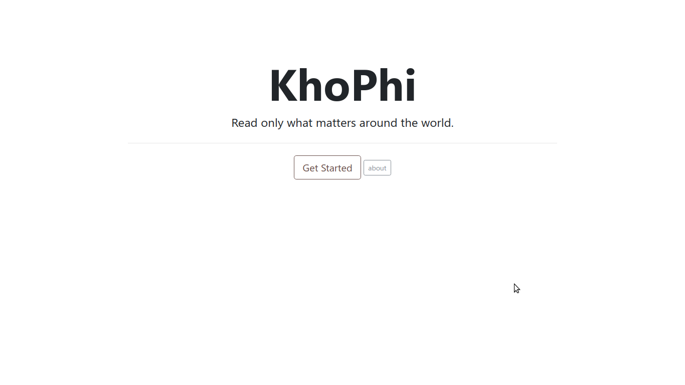
Let’s get this done quickly. Angular Material 2 is finally something I wanna get my head into. Streamlined and ready for all the heavy lifting. But how do you create a Responsive Side Menu navigation with it? Something as shown below?
Well, let’s get to it.
By the way, we’ll be using Angular 6. Duh!
SideBar
Sidebar is already available in the Material 2 components for Angular. Toggling is also ready. What we need is how to observe the screen size and close or show the sidebar navigation.
To do so, we use one of the tricks under Angular’s Flex Layout‘s sleeve
  constructor(media: ObservableMedia) {
    this.watcher = media.subscribe((change: MediaChange) => {
      if (change.mqAlias === 'sm' || change.mqAlias === 'xs') {
        this.opened = false;
        this.over = 'over';
      } else {
        this.opened = true;
        this.over = 'side';
      }
    });
  }
There we go. The above snippet came from the menu.component.ts file.
All the source code is available at: Github.com/Seanmavley/Upcoming
The this.opened and this.over is tied to the template for controlling the opening and closing. Whenever the MediaChangematches the breakpoints aliases, sm or xs, we want the sidebar to be closed.
The sidebar in the template is also tuned into the dance tunes via some @input property bindings, like so:
  <mat-sidenav #sidenav [(mode)]="over" [(opened)]="opened" class="bottom-to-top">

   ....

  </mat-sidenav>
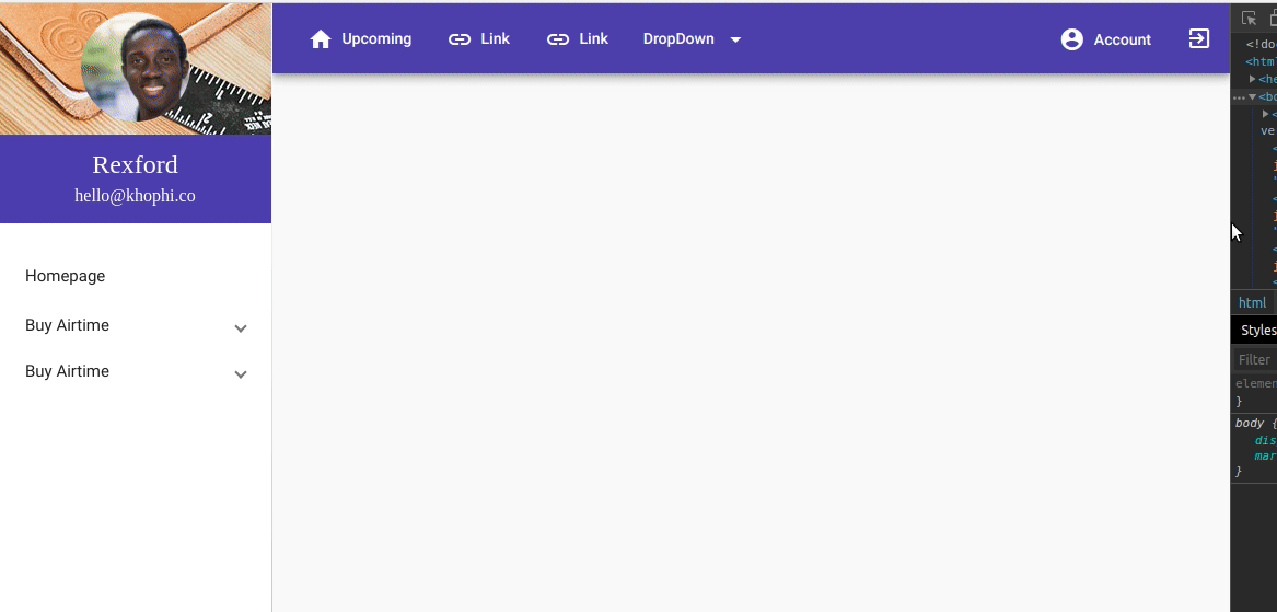
Now you see we’ve got something like this:
      <button mat-icon-button (click)="sidenav.toggle()" fxShow.sm="true" fxShow.gt-sm="false">
        <mat-icon>menu</mat-icon>
      </button>
Two things
One, sidenav template variable we defined up there in the <mat-sidenav> exposes a few methods for us to use on the <mat-sidenav> component, namely the .toggle(). It does what its name suggests. By clicking on the humberger, we toggle the navigation in mobile mode. To bring the humberger up only in mobile mode…
Then secondly, notice the fxShow.sm="true" fxShow.gt-sm="false". We taking advantage of the hide-show functionality which comes for free with Flex Layout
In CSS grid terms, Flexbox arguably is the Messiah!
Same concept as the d-none d-sm-none d-md-none stuff in Bootstrap 4+. Same concept, with different skin paint.
That way, we get to hide and show a part of the toolbar menus when on landscape or mobile.
      <span fxShow.lt-md="false" fxShow.gt-sm="true">
        <button mat-button>
          <mat-icon class="mr-1">link</mat-icon>
          Link</button>
        <button mat-button>
          <mat-icon class="mr-1">link</mat-icon>
          Link</button>
        <button mat-button [matMenuTriggerFor]="dropDown">
          DropDown
          <mat-icon class="ml-1">arrow_drop_down</mat-icon>
        </button>
        <mat-menu #dropDown="matMenu" overlapTrigger="false">
          <button mat-menu-item>
            <mat-icon>dialpad</mat-icon>
            <span>Dropdown Link 1</span>
          </button>
          <button mat-menu-item disabled>
            <mat-icon>voicemail</mat-icon>
            <span>Dropdown Link 2</span>
          </button>
        </mat-menu>
      </span>
Booom!
Just a few hours with Flex Layout, not fully wrapped my head around, but I’m already loving it.
Imports, Oh Dear!
Each component is a Module, thus importing required to use. In all, in one shared module, here’s all the components we used in getting the sidebar responsive nav thing going:
import { NgModule } from '@angular/core';
import { MatButtonModule, MatCheckboxModule,
  MatIconModule, MatMenuModule, MatSidenavModule,
  MatExpansionModule, MatListModule } from '@angular/material';
import { MatToolbarModule } from '@angular/material/toolbar';
import { FlexLayoutModule } from '@angular/flex-layout';


@NgModule({
  imports: [
    MatButtonModule,
    MatCheckboxModule,
    MatToolbarModule,
    MatIconModule,
    MatMenuModule,
    MatSidenavModule,
    FlexLayoutModule,
    MatExpansionModule,
    MatListModule,
  ],
  exports: [
    MatButtonModule,
    MatCheckboxModule,
    MatToolbarModule,
    MatIconModule,
    MatMenuModule,
    MatSidenavModule,
    FlexLayoutModule,
    MatExpansionModule,
    MatListModule
  ],
})
export class SharedModule { }
Cool!
Conclusion
So checkout the example on Github and lemme know in the comments if any issue.