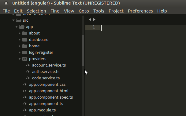
Add Angular Splash Screen
Twitter’s Progressive Web Application has this beautiful splash screen. Splash screens are awesome. In a PWA, having a splash screen mimics how a native application boots up.
Here’s Twitter’s splash screen:
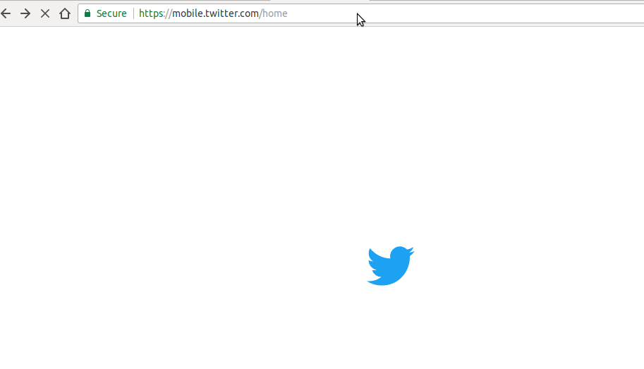
To see Twitter’s splash screen in action, visit https://mobile.twitter.com
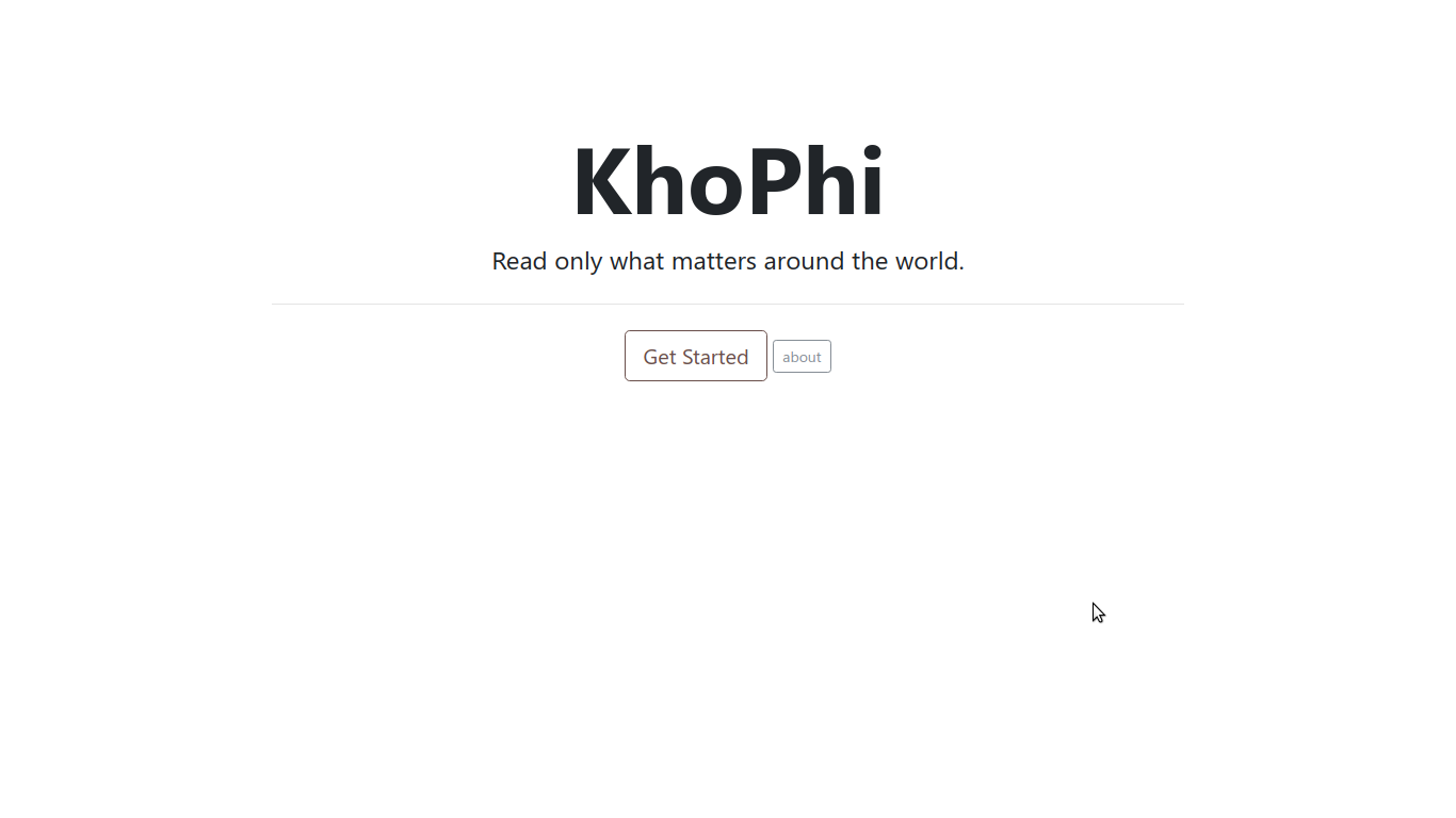
And here’s what we hope to accomplish:

To see KhoPhi’s splash screen in action, visit… oh wait, we’re in closed beta now. The link will be added soon.
Let’s add that feature to our application, shall we?
Our Splash Screen
Let’s follow these basic steps to bring up our application.
- Using Angular
ngcli, create a new project (ng new myProject --mobile) - In the project directory, let’s add the service worker (
npm install @angular/service-worker) – This is optional, but useful, to prevent our logo for the splash screen loading from the network all the time. Plus, what is PWA without offline support? - Add this line:
"serviceWorker": true,somewhere within yourangular-cli.jsonfile.
Now, open your index.html and let’s add the loading functionality. You will find this piece in your index.html, just after creating your project:
<!doctype html>
<html lang="en">

<head>
  <meta charset="utf-8">
  <title>KhoPhi - Start with only what matters.</title>
  <base href="/">
  <meta name="viewport" content="width=device-width, initial-scale=1">
  <!-- <link href="https://fonts.googleapis.com/icon?family=Material+Icons" rel="stylesheet"> -->
  <link rel="icon" type="image/x-icon" href="assets/icon/favicon.ico">
</head>

<body>
  <app-root>Loading...</app-root>

</body>
</html>
Right off the bat, you’ll notice the <app-root>Loading...</loading>part would be replaced eventually when Angular initializes. This isn’t news. That’s the way it happens.
Now, instead of the boring looking Loading... thing, we could put something interesting, like this pure CSS Loading spinner from http://cssload.net/en/spinners
There are some amazing pure CSS spinners on the site. Let’s go with the Windows8 loading spinner.
It is important to add the entire CSS of the spinner you choose within the index.html. There is no need to make, yet another network request just pull a resource that’s supposed to be present for a splash screen.
With that in mind, let us tweak our index.html with the spinner in between the <app-root> ... </app-root>. We know everything within that will be replaced entirely after Angular is fully loaded.
<!doctype html>
<html lang="en">

<head>
  <meta charset="utf-8">
  <title>KhoPhi - Start with only what matters.</title>
  <base href="/">
  <meta name="viewport" content="width=device-width, initial-scale=1">
  <!-- <link href="https://fonts.googleapis.com/icon?family=Material+Icons" rel="stylesheet"> -->
  <link rel="icon" type="image/x-icon" href="assets/icon/favicon.ico">

  <!-- <link rel="manifest" href="./manifest.json"> -->
  <style type="text/css">
  .windows8 {
    position: relative;
    width: 130px;
    height: 130px;
    margin: auto;
    margin-top: 80px;
  }

  .windows8 .wBall {
    position: absolute;
    width: 124px;
    height: 124px;
    opacity: 0;
    transform: rotate(225deg);
    -o-transform: rotate(225deg);
    -ms-transform: rotate(225deg);
    -webkit-transform: rotate(225deg);
    -moz-transform: rotate(225deg);
    animation: orbit 4.8425s infinite;
    -o-animation: orbit 4.8425s infinite;
    -ms-animation: orbit 4.8425s infinite;
    -webkit-animation: orbit 4.8425s infinite;
    -moz-animation: orbit 4.8425s infinite;
  }

  .windows8 .wBall .wInnerBall {
    position: absolute;
    width: 16px;
    height: 16px;
    background: rgb(0, 0, 0);
    left: 0px;
    top: 0px;
    border-radius: 16px;
  }

  .windows8 #wBall_1 {
    animation-delay: 1.056s;
    -o-animation-delay: 1.056s;
    -ms-animation-delay: 1.056s;
    -webkit-animation-delay: 1.056s;
    -moz-animation-delay: 1.056s;
  }

  .windows8 #wBall_2 {
    animation-delay: 0.203s;
    -o-animation-delay: 0.203s;
    -ms-animation-delay: 0.203s;
    -webkit-animation-delay: 0.203s;
    -moz-animation-delay: 0.203s;
  }

  .windows8 #wBall_3 {
    animation-delay: 0.4265s;
    -o-animation-delay: 0.4265s;
    -ms-animation-delay: 0.4265s;
    -webkit-animation-delay: 0.4265s;
    -moz-animation-delay: 0.4265s;
  }

  .windows8 #wBall_4 {
    animation-delay: 0.6295s;
    -o-animation-delay: 0.6295s;
    -ms-animation-delay: 0.6295s;
    -webkit-animation-delay: 0.6295s;
    -moz-animation-delay: 0.6295s;
  }

  .windows8 #wBall_5 {
    animation-delay: 0.843s;
    -o-animation-delay: 0.843s;
    -ms-animation-delay: 0.843s;
    -webkit-animation-delay: 0.843s;
    -moz-animation-delay: 0.843s;
  }


  @keyframes orbit {
    0% {
      opacity: 1;
      z-index: 99;
      transform: rotate(180deg);
      animation-timing-function: ease-out;
    }

    7% {
      opacity: 1;
      transform: rotate(300deg);
      animation-timing-function: linear;
      origin: 0%;
    }

    30% {
      opacity: 1;
      transform: rotate(410deg);
      animation-timing-function: ease-in-out;
      origin: 7%;
    }

    39% {
      opacity: 1;
      transform: rotate(645deg);
      animation-timing-function: linear;
      origin: 30%;
    }

    70% {
      opacity: 1;
      transform: rotate(770deg);
      animation-timing-function: ease-out;
      origin: 39%;
    }

    75% {
      opacity: 1;
      transform: rotate(900deg);
      animation-timing-function: ease-out;
      origin: 70%;
    }

    76% {
      opacity: 0;
      transform: rotate(900deg);
    }

    100% {
      opacity: 0;
      transform: rotate(900deg);
    }
  }

  @-o-keyframes orbit {
    0% {
      opacity: 1;
      z-index: 99;
      -o-transform: rotate(180deg);
      -o-animation-timing-function: ease-out;
    }

    7% {
      opacity: 1;
      -o-transform: rotate(300deg);
      -o-animation-timing-function: linear;
      -o-origin: 0%;
    }

    30% {
      opacity: 1;
      -o-transform: rotate(410deg);
      -o-animation-timing-function: ease-in-out;
      -o-origin: 7%;
    }

    39% {
      opacity: 1;
      -o-transform: rotate(645deg);
      -o-animation-timing-function: linear;
      -o-origin: 30%;
    }

    70% {
      opacity: 1;
      -o-transform: rotate(770deg);
      -o-animation-timing-function: ease-out;
      -o-origin: 39%;
    }

    75% {
      opacity: 1;
      -o-transform: rotate(900deg);
      -o-animation-timing-function: ease-out;
      -o-origin: 70%;
    }

    76% {
      opacity: 0;
      -o-transform: rotate(900deg);
    }

    100% {
      opacity: 0;
      -o-transform: rotate(900deg);
    }
  }

  @-ms-keyframes orbit {
    0% {
      opacity: 1;
      z-index: 99;
      -ms-transform: rotate(180deg);
      -ms-animation-timing-function: ease-out;
    }

    7% {
      opacity: 1;
      -ms-transform: rotate(300deg);
      -ms-animation-timing-function: linear;
      -ms-origin: 0%;
    }

    30% {
      opacity: 1;
      -ms-transform: rotate(410deg);
      -ms-animation-timing-function: ease-in-out;
      -ms-origin: 7%;
    }

    39% {
      opacity: 1;
      -ms-transform: rotate(645deg);
      -ms-animation-timing-function: linear;
      -ms-origin: 30%;
    }

    70% {
      opacity: 1;
      -ms-transform: rotate(770deg);
      -ms-animation-timing-function: ease-out;
      -ms-origin: 39%;
    }

    75% {
      opacity: 1;
      -ms-transform: rotate(900deg);
      -ms-animation-timing-function: ease-out;
      -ms-origin: 70%;
    }

    76% {
      opacity: 0;
      -ms-transform: rotate(900deg);
    }

    100% {
      opacity: 0;
      -ms-transform: rotate(900deg);
    }
  }

  @-webkit-keyframes orbit {
    0% {
      opacity: 1;
      z-index: 99;
      -webkit-transform: rotate(180deg);
      -webkit-animation-timing-function: ease-out;
    }

    7% {
      opacity: 1;
      -webkit-transform: rotate(300deg);
      -webkit-animation-timing-function: linear;
      -webkit-origin: 0%;
    }

    30% {
      opacity: 1;
      -webkit-transform: rotate(410deg);
      -webkit-animation-timing-function: ease-in-out;
      -webkit-origin: 7%;
    }

    39% {
      opacity: 1;
      -webkit-transform: rotate(645deg);
      -webkit-animation-timing-function: linear;
      -webkit-origin: 30%;
    }

    70% {
      opacity: 1;
      -webkit-transform: rotate(770deg);
      -webkit-animation-timing-function: ease-out;
      -webkit-origin: 39%;
    }

    75% {
      opacity: 1;
      -webkit-transform: rotate(900deg);
      -webkit-animation-timing-function: ease-out;
      -webkit-origin: 70%;
    }

    76% {
      opacity: 0;
      -webkit-transform: rotate(900deg);
    }

    100% {
      opacity: 0;
      -webkit-transform: rotate(900deg);
    }
  }

  @-moz-keyframes orbit {
    0% {
      opacity: 1;
      z-index: 99;
      -moz-transform: rotate(180deg);
      -moz-animation-timing-function: ease-out;
    }

    7% {
      opacity: 1;
      -moz-transform: rotate(300deg);
      -moz-animation-timing-function: linear;
      -moz-origin: 0%;
    }

    30% {
      opacity: 1;
      -moz-transform: rotate(410deg);
      -moz-animation-timing-function: ease-in-out;
      -moz-origin: 7%;
    }

    39% {
      opacity: 1;
      -moz-transform: rotate(645deg);
      -moz-animation-timing-function: linear;
      -moz-origin: 30%;
    }

    70% {
      opacity: 1;
      -moz-transform: rotate(770deg);
      -moz-animation-timing-function: ease-out;
      -moz-origin: 39%;
    }

    75% {
      opacity: 1;
      -moz-transform: rotate(900deg);
      -moz-animation-timing-function: ease-out;
      -moz-origin: 70%;
    }

    76% {
      opacity: 0;
      -moz-transform: rotate(900deg);
    }

    100% {
      opacity: 0;
      -moz-transform: rotate(900deg);
    }
  }

  </style>
</head>

<body>
  <app-root>
    <div class="windows8">
      <div class="wBall" id="wBall_1">
        <div class="wInnerBall"></div>
      </div>
      <div class="wBall" id="wBall_2">
        <div class="wInnerBall"></div>
      </div>
      <div class="wBall" id="wBall_3">
        <div class="wInnerBall"></div>
      </div>
      <div class="wBall" id="wBall_4">
        <div class="wInnerBall"></div>
      </div>
      <div class="wBall" id="wBall_5">
        <div class="wInnerBall"></div>
      </div>
    </div>
    <center style="margin-top:5rem;">
    <img src="assets/img/forbg.svg" style="width:220px;">
  </center>
  </app-root>
...
You should notice there this part:
<center style="margin-top:5rem;">
    <img src="assets/img/forbg.svg" style="width:220px;">
</center>
If you’re using a front-end CSS framework like Bootstrap, you might be tempted to use their margining classes, like my-5 or the like.
Any of that sort added will not be applied, as at the time of the load of index.html, Bootstrap or whatever your frontend CSS is, isn’t fully loaded i.e, if you added your CSS within the angular-cli.json
I used an .svg file for the logo in my case, to save size. With SVG, the file sizes can be as minimal in size as possible, however, can be scaled to big or even bigger without losing quality.
You could even make your SVG file into a data URI (base64) even making it faster.
Conclusion
Fire up the Angular app with ng serve -o and enjoy the experience in the browser.
Hope you enjoyed this one. See you in the next.